Krea 2 Mood Boards: How to Lock In a Visual Style for Consistent AI Image Generation
Krea 2's mood board feature analyzes uploaded images to extract a style profile. Learn how to use it for brand-consistent AI image generation at scale.

Why Visual Consistency Is the Hard Part of AI Image Generation
Anyone who has spent time with AI image generation tools knows the frustration: you get one great result, try to replicate the style in the next prompt, and end up with something that looks like it came from a completely different project. The colors are off. The mood shifted. The composition feels wrong. You’re not making a coherent body of work — you’re rolling dice.
This is the core problem Krea 2’s mood board feature was built to solve. Instead of describing a style in words and hoping the model interprets it correctly, you show it. You upload a collection of reference images, and Krea 2 analyzes them to extract a visual style profile that carries through every image you generate after that.
For brand teams, content creators, and designers who need consistent AI image generation at scale, this changes the workflow significantly. Here’s how it works and how to get the most out of it.
What Krea 2 Is and Why the Mood Board Feature Matters
Krea is an AI-powered creative platform focused on image and video generation. Krea 2 is the platform’s updated generation model, and it places particular emphasis on visual quality and style control — two things where earlier AI image tools frequently fell short.
The mood board feature is one of the standout additions. It’s designed for a specific use case: you have a visual identity, a brand aesthetic, or a creative direction that you want to maintain across a batch of generated images. Rather than crafting elaborate style descriptors in every prompt, you build a mood board once and use it as a persistent reference.
This matters for a few reasons:
- Prompt engineering for style is unreliable. Describing “warm cinematic lighting with muted earth tones and a slightly grainy texture” gets you something different every time. A reference image is unambiguous.
- Brand consistency at scale requires repeatability. One good image isn’t enough. You need fifty that look like they belong together.
- Creative direction is visual, not verbal. Designers think in images. Forcing that into text is lossy and slow.
The mood board feature closes that gap between having a clear visual vision and being able to execute it consistently through AI generation.
How Krea 2’s Mood Board Feature Actually Works
Style Extraction, Not Image Copying
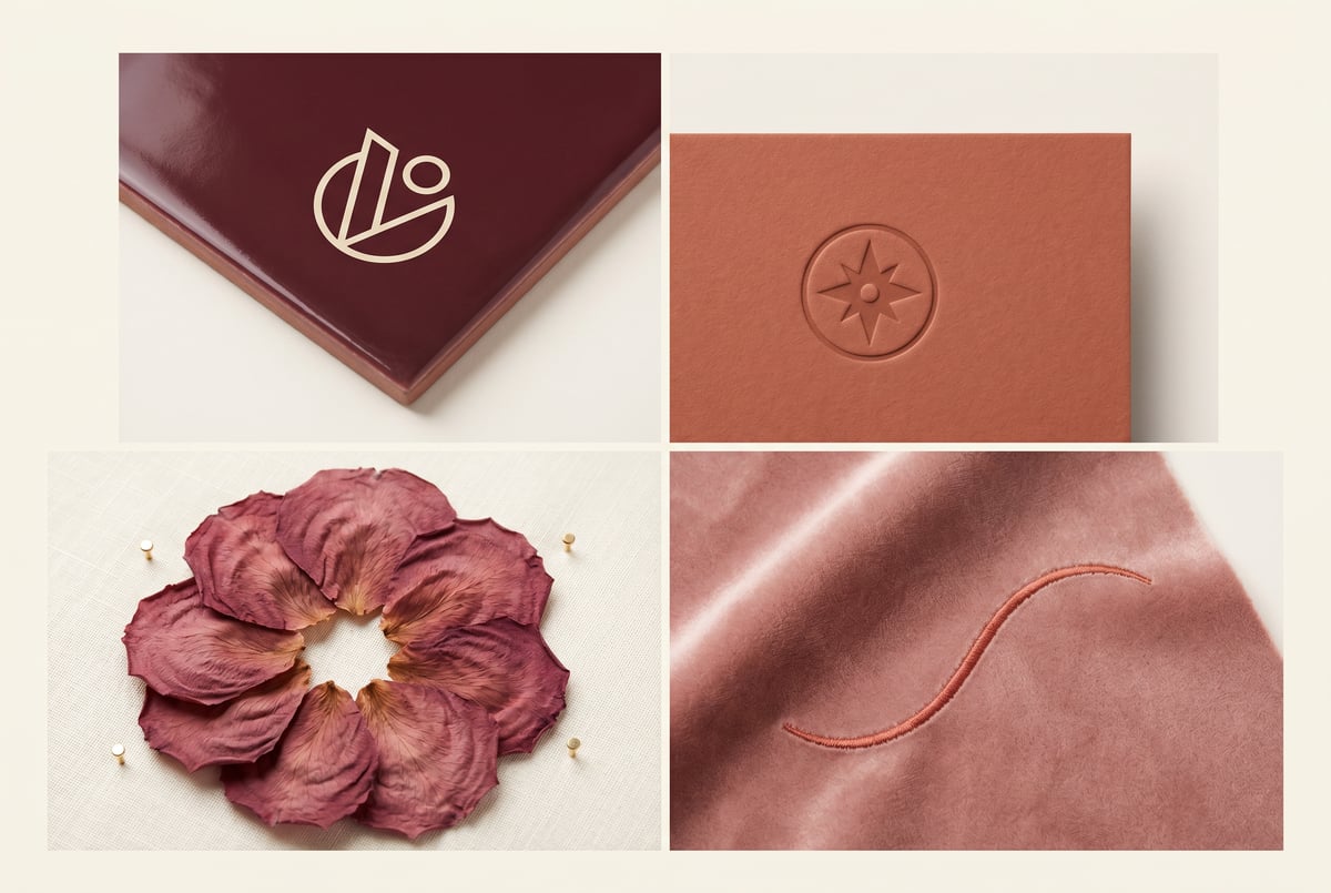
The first thing to understand is that Krea 2’s mood board does not copy or remix your uploaded images. It analyzes them to extract a style profile — things like color palette, contrast levels, compositional tendencies, texture, lighting character, and visual mood.
The output is a generated image that reflects those stylistic qualities applied to whatever subject or scene you’re prompting for. Your reference images inform how the image looks, not what it contains.
This distinction matters legally and creatively. You’re not feeding competitor work or stock images into a copy machine. You’re using visual references the same way a creative director would pin images to a physical mood board — to communicate direction.
What the Model Extracts
When you upload images to a Krea 2 mood board, the model processes several dimensions of visual style:
- Color relationships — dominant hues, saturation levels, warm/cool balance, contrast ratios
- Tonal range — whether the images skew bright and airy, dark and dramatic, flat and matte, or punchy and saturated
- Texture and grain — smooth and clean versus gritty, filmic, or painterly
- Compositional tendencies — centered subjects, negative space use, perspective, framing
- Light quality — hard vs. soft light, directional vs. ambient, natural vs. artificial
The more coherent your uploaded references are, the cleaner the style extraction. A set of eight images that all share a consistent aesthetic will produce a much more reliable style profile than eight images pulled from different genres.
Image Count and Selection
Krea 2 performs best with mood boards of roughly 5–15 images. Too few and the model doesn’t have enough signal to establish a reliable pattern. Too many, especially if they’re inconsistent, introduces noise that dilutes the style.
Quality and coherence matter more than quantity. Five tightly curated images from the same photographer or campaign will outperform twenty loosely related images.
Step-by-Step: Building a Mood Board in Krea 2
Step 1: Define Your Visual Target
Before opening Krea 2, be clear about what visual style you’re trying to capture. This sounds obvious, but it’s worth doing deliberately.
Ask yourself:
- What emotion or mood should the images convey?
- What are the dominant colors or color relationships?
- Is this style realistic, stylized, illustrative, or something else?
- Are there existing examples of this style — photography, design work, film stills — that you can point to?
Everyone else built a construction worker.
We built the contractor.
One file at a time.
UI, API, database, deploy.
Write down three to five adjectives that describe the style. Not to use in prompts, but to guide your reference image selection.
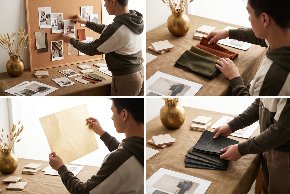
Step 2: Collect Reference Images
Gather images that exemplify the style you’ve defined. Sources to consider:
- Your own brand assets — existing approved photography, campaign visuals, product shots
- Design inspiration platforms — Behance, Dribbble, Cosmos, or Are.na for curated visual references
- Photography portfolios — photographers whose work matches your aesthetic direction
- Film stills — if you’re going for a cinematic look, specific films are excellent reference points
- Editorial work — magazine spreads from publications with a consistent visual voice
Avoid mixing styles. If half your references are high-key minimalist and the other half are dark and moody, the model will try to average them and you’ll get neither.
Step 3: Upload and Build the Mood Board
In Krea 2, navigate to the mood board section within the image generation interface. Upload your selected reference images. The platform will begin processing them.
A few practical notes:
- Use high-resolution images where possible. Low-quality compressed images carry less style signal.
- Crop or adjust images if needed to remove irrelevant areas. If you’re referencing a photo for its color palette but the composition is irrelevant, crop to the area that best represents what you want.
- Name your mood board descriptively. If you’re building multiple boards for different use cases, clear naming saves time later.
Step 4: Test with Simple Prompts First
Once your mood board is set, run a few test generations before committing to a full production batch. Use simple, neutral prompts that let the style carry the image rather than fighting it.
For example, if you’re building a mood board for a lifestyle brand’s content, start with something like “person sitting at a table with coffee” — a subject with no inherent style preference. Evaluate whether the generated image reflects the mood board’s color palette, tonal quality, and overall feel.
Adjust the style influence weight if Krea 2 offers that control. Higher influence means the style dominates more heavily; lower influence gives your text prompt more room to shape the result.
Step 5: Iterate on the Board
If the test results aren’t matching your vision, don’t immediately rewrite your prompts. Revisit the mood board itself first.
Common fixes:
- Remove outlier images that don’t fit the dominant style
- Add more images that exemplify a quality the model seems to be missing
- Replace images where the subject matter is distracting from the style (e.g., a portrait with a very distinctive face might pull attention away from the lighting style you want)
This iterative approach to board-building often gets you to a reliable style profile faster than prompt engineering.
Practical Use Cases for Style-Locked AI Image Generation
Brand Content at Scale
Marketing teams producing content across multiple channels — social, email, paid ads, web — face a real consistency challenge. Maintaining a visual brand standard across hundreds of assets is difficult even with a professional photo library.
A well-built mood board based on your brand’s existing photography can produce new, original content that looks like it belongs in the same family. You can generate product lifestyle shots, abstract textures, environmental imagery, and supporting visuals that all carry the same visual DNA.
This is particularly useful for filling content gaps between photo shoots or localizing content for different markets without separate productions.
Product Design and Concept Visualization
Industrial designers and product teams use mood boards to communicate aesthetic direction early in a project. Krea 2 lets you turn that mood board into generated concept visuals — product sketches, material explorations, environmental contexts — that reflect the target aesthetic rather than defaulting to generic AI output.
A design team can share mood-board-guided concept images with stakeholders and get meaningful feedback on visual direction before committing to physical prototypes or detailed renders.
Editorial and Publishing
Publications with a strong visual identity — whether that’s a newsletter, a digital magazine, or a content blog — need every illustration and supporting image to feel consistent. A mood board capturing the publication’s visual style lets editors generate original artwork that fits the house style without commissioning custom illustration for every piece.
E-commerce and Catalog Photography
Brands with large product catalogs often struggle with visual consistency across categories, especially when products were photographed at different times or by different photographers. A mood board capturing the target look — lighting style, background treatment, color grading — can be used to generate consistent lifestyle imagery or to inform post-production standards.
Tips for Getting Better Results
Prioritize Lighting Consistency in Your References
Lighting is one of the strongest style signals. Images with similar lighting conditions — same quality of light, similar direction, similar warmth — will produce a much stronger style profile than a mix of harsh studio light and soft natural light.
Use Non-Subject References When Appropriate
If you want to capture a color palette or texture without the model getting distracted by the subject matter, consider using abstract or environmental images: textures, landscapes, architectural details, fabric. These communicate visual qualities without pulling the model toward a particular type of subject.
Keep a Library of Tested Mood Boards
Once you’ve built a mood board that produces reliable results, save it and document it. Over time, build a library of mood boards for different use cases: one for social content, one for editorial, one for product visualization. This turns a one-time setup into a reusable asset.
Combine Style with Clear Subject Prompts
The mood board handles the how — color, mood, texture, light. Your text prompt handles the what — subject, action, setting, composition. When these two inputs are clearly defined and don’t conflict with each other, you get the most controlled results.
Avoid asking the style to do work that the prompt should do, and vice versa.
Scaling Style-Consistent Image Generation with MindStudio
Building a mood board in Krea 2 solves the one-at-a-time consistency problem. But if you need to produce images at scale — think hundreds of product shots, a full social media content calendar, or automated visual assets for a publishing workflow — doing it manually still creates a bottleneck.
This is where MindStudio’s AI Media Workbench fits in. MindStudio gives you access to the major image generation models — including FLUX and others — in one place, with no API keys or separate accounts required. More importantly, it lets you chain image generation into automated workflows.
A practical example: you could build a MindStudio agent that pulls a list of product names and descriptions from a Google Sheet, passes each one through a structured image generation prompt, applies consistent style parameters you’ve defined, and outputs finished images back to a folder or CMS. What would take hours of manual prompting becomes a background process that runs on a schedule.
For teams that have already done the work of defining their visual style — through Krea 2 mood boards or any other method — MindStudio’s image generation workflow capabilities let you operationalize that style at scale. The visual direction is set; MindStudio handles the production volume.
MindStudio is free to start, and most agents take under an hour to build. You can explore it at mindstudio.ai.
Frequently Asked Questions
Does Krea 2’s mood board feature copy or remix the reference images?
No. The mood board analyzes reference images to extract stylistic characteristics — color, tone, texture, light quality, composition tendencies — and applies those characteristics to new, original generations. The content and subjects of your reference images are not reproduced or incorporated into the output. It functions more like showing the model a visual direction than giving it material to sample.
How many images should I include in a Krea 2 mood board?
Five to fifteen images is a practical range. The key is coherence, not quantity. A tightly curated set of five images with a consistent visual aesthetic will outperform twenty images that span different styles. Focus on selecting references that all exemplify the same quality of light, color palette, or mood rather than covering a wide range.
Can I use a mood board for video generation, or is it limited to images?
Krea 2 primarily applies mood boards to image generation. Video generation is a different pipeline with its own style controls. That said, establishing a strong still-image style baseline through mood boards is a common first step before moving into video production, since it gives you visual targets that can inform lighting setups, color grading, and motion direction downstream.
What kinds of reference images work best for style extraction?
References with strong, consistent stylistic qualities tend to work best. Photography from a single photographer or campaign, film stills from a visually distinctive director, or editorial work from a publication with a strong house style are all good sources. Abstract images — textures, environments, architectural details — can be useful for capturing color and tonal qualities without subject-matter distraction. Avoid mixing references that represent conflicting styles.
Is Krea 2’s mood board feature suitable for brand use, or is there a risk of reproducing copyrighted material?
Because the feature extracts style characteristics rather than copying image content, the direct reproduction risk is low. Style is generally not copyrightable — what’s protected is specific creative expression, not visual direction, color palettes, or compositional approaches. That said, it’s worth applying the same judgment you’d use in any creative reference context: using your own brand assets or public-domain references as primary sources is the cleanest approach. Consult your legal team if you’re working in a context where IP exposure is a concern.
How does a mood board differ from using LoRA models for style consistency?
LoRAs (Low-Rank Adaptation models) are fine-tuned model weights trained on a specific style, subject, or aesthetic. They’re more deeply baked into the generation process and generally more consistent — but they require training data, compute, and technical setup. Mood boards are a faster, lighter-weight approach: no training required, no technical configuration, results available immediately. For most brand and content teams that don’t have ML infrastructure, mood boards are the practical path. LoRAs make sense when you need extremely high fidelity to a very specific style and are willing to invest in the setup.
Key Takeaways
- Krea 2’s mood board feature solves the style consistency problem in AI image generation by letting you show the model a visual direction rather than describe it in text.
- The feature extracts style characteristics — color, tone, light, texture, composition — from uploaded reference images and applies them to new generations.
- Effective mood boards use 5–15 coherent, tightly curated references. Consistency in the input produces consistency in the output.
- Test with simple prompts first, iterate on the board before adjusting prompts, and save successful boards as reusable assets.
- For production-scale image generation with consistent style, tools like MindStudio let you automate the workflow — taking the visual standard you’ve established and applying it across hundreds of assets without manual repetition.