
Susan Kare and the Design Rules Behind the Original Mac's Icons
Susan Kare explains how she designed Happy Mac, Chicago font, and the Command key symbol, and the constraints that shaped early Mac icon design.
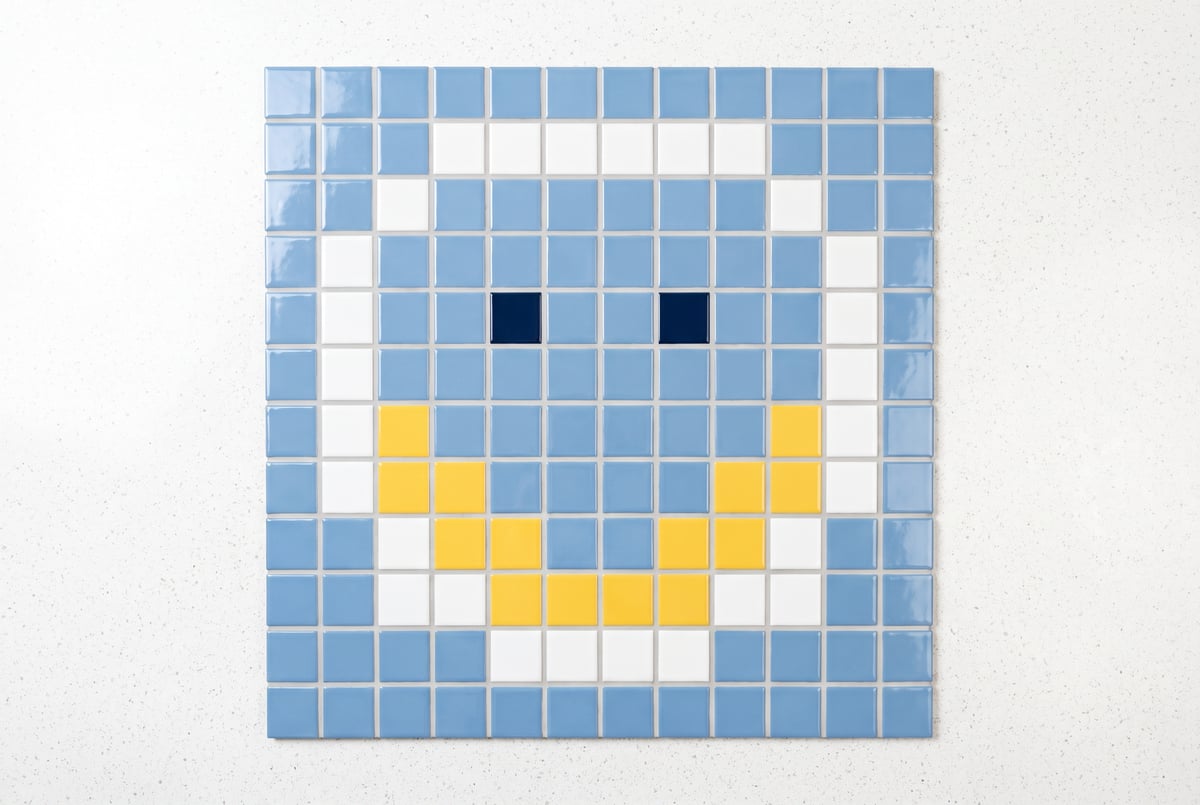
How did Susan Kare design the original Macintosh icons?
Susan Kare designed the Macintosh’s icons and system fonts working within a strict 16 by 16 or 32 by 32 pixel grid, black and white only, with no antialiasing and no text where possible. She had no computer science background. She came from art history and a hands-on job doing typography by hand at a science museum, and she treated the pixel grid the way a mosaic artist treats tile: a hard constraint that forces clarity rather than a limitation to fight against. The result was a visual language, Happy Mac, the Chicago font, the lasso and paint bucket tools, that shaped how graphical computing looked for a decade.
TL;DR
- Susan Kare joined the Macintosh team after a friend, programmer Andy Hertzfeld, recruited her to design symbols and typefaces for a computer that didn’t have a case yet.
- She had no formal design-for-computers training, only a PhD in art history and experience hand-setting type with Letraset at Philadelphia’s Franklin Institute Science Museum.
- Every icon had to work inside a 16 by 16 pixel black-and-white grid (32 by 32 for some elements), which she treated as a creative constraint rather than an obstacle.
- The Chicago font, her first typeface for the Mac, used horizontals, verticals, and 45 degree angles at a 9 pixel cap height to look tidy against a jagged screen, and it later shipped on the original iPod.
- Happy Mac, the smiling computer icon shown at startup, drew on the idea that simple, low-detail faces feel universal, an idea she later connected to cartoonist Scott McCloud’s writing on comics and abstraction.
- Steve Jobs personally intervened on naming and branding decisions, rejecting “Apple key” for the Command symbol and asking that font names honor “world-class cities” instead of small towns near her Pennsylvania high school.
- Some icons, like the bomb for total system failure, were meant as internal jokes nobody would actually see in production, but users did see them, prompting real support calls.
Other agents ship a demo. Remy ships an app.
Real backend. Real database. Real auth. Real plumbing. Remy has it all.

What was Susan Kare’s background before joining Apple?
Kare was an art major with a PhD in art history, not a programmer or a computer scientist. Before Apple, she was welding a life-size razorback hog for a museum commission in Arkansas, work she found satisfying but isolating. Her connection to the Macintosh project came through Andy Hertzfeld, a high school friend who was writing system software at Apple. He knew she had done yearbook design and had some typographic experience, from working the Letraset rub-down lettering system and a phototype machine at the Franklin Institute Science Museum in Philadelphia, and asked her to interview for a role designing small symbols and typefaces.
To prepare, she checked out typography books and font sample books from the Palo Alto library and brought them to the interview, hoping to look informed. Hertzfeld also suggested she bring examples of bitmap-style graphics, so she sketched images on graph paper, a pond, a boot, scraps of paper, without being told exactly what to make. She got the job, and by her own account nobody even asked her about font design despite her preparation. That notebook of early graph-paper sketches is now in the permanent collection of the Museum of Modern Art.
What design principles shaped the Mac’s visual language?
Kare has credited graphic designer Paul Rand, known for the IBM and UPS logos, with a piece of advice that guided her work: focus on making things meaningful and memorable, and let form follow a strong idea rather than the reverse. On the Macintosh project specifically, the team’s guiding goal was to build a computer anyone could use without needing a manual, and to make the interface feel friendly rather than technical.
That translated into concrete rules. Icons should communicate through metaphor rather than literal depiction. A simple pencil, for instance, reads as “writing” more universally than a detailed chrome pen would, because the pen implies a specific object while the pencil implies an action anyone recognizes. She has pointed to cartoonist Scott McCloud’s writing on comics for a related idea: highly detailed faces read as specific individuals, while simplified faces let viewers project themselves onto the image. That’s part of why Happy Mac works as a friendly, generic presence rather than a portrait of anyone in particular.
She also avoided depicting specific product hardware in icons when possible. An early save icon based on a real 3.5 inch floppy disk, and a print icon that mimicked the actual sprocket holes on Apple’s ImageWriter paper, both illustrate the trap: icons tied to a specific physical product age badly once that hardware disappears, while an abstract metaphor holds up longer.
What was the Chicago font and why did it matter?
Other agents start typing. Remy starts asking.
Scoping, trade-offs, edge cases — the real work. Before a line of code.
Chicago was the first typeface Kare designed for the Mac, built with a 9 pixel cap height using horizontals, verticals, and 45 degree angles to counter the jagged look of early bitmap text. The Macintosh’s ability to render proportionally spaced fonts, where an “M” and an “I” each take up appropriately different widths rather than identical fixed slots, was itself a technical advancement she says she didn’t fully appreciate at the time but which visibly improved legibility over the monospaced norm.
Chicago appeared in the Mac’s title bars and, notably, was reused years later on the original iPod interface, a detail Kare has said she was pleased to learn given the font’s origins in a 128K black-and-white computer. Beyond Chicago, she designed additional system fonts filling roles similar to Times Roman and Helvetica, which became New York and Geneva, plus a decorative cut-and-paste style face nicknamed “Ransom” (after ransom notes assembled from newspaper clippings). Fonts were originally going to carry names of towns along a commuter rail line near her and Hertzfeld’s Pennsylvania high school, until Steve Jobs suggested the fonts be named after “world-class cities” instead, which is how names like New York and Geneva stuck rather than the original small-town references.
Why is Happy Mac shaped the way it is?
Happy Mac exists because the original 128K Macintosh took a noticeable amount of time to boot, and the team wanted an on-screen image reassuring users that the machine was working normally rather than stuck. Kare has said the smiling face concept likely traces back to a smiley button she owned around age 14. Constrained to a 32 by 32 pixel grid, she rendered it as a simple, minimally detailed face, consistent with her broader belief that a small number of salient details, rather than exhaustive realism, produce the clearest and most universally readable icon.
The same startup-state design brief also called for a failure state. Kare designed an “unhappy Mac” (a sick or hungover-looking face) and, separately, a bomb icon for total system failure, both under the assumption at the time that ordinary users would never actually see them. That assumption didn’t hold: the bomb icon did surface for real users, and Kare has described a support call from a Macintosh owner worried her computer was literally about to explode.
How did Steve Jobs influence icon and interface decisions?
Kare has described Jobs as someone who would visit the software group’s workspace, often at the end of the day, to see what was new, and who intervened directly on brand-sensitive decisions. When the team planned to use small Apple logos as a keyboard shortcut symbol on a dedicated key (what became the Command key), Jobs rejected it, reportedly objecting that scattering the Apple logo across the keyboard (“an Apple farm”) diluted a logo he considered precious. That sent Kare back to the library, where she found a Scandinavian symbol used on camping-site maps to denote an “interesting feature,” which she adapted into the cloverleaf-like glyph that still appears on Mac keyboards today. Jobs also weighed in on font naming, as noted above, pushing for globally recognizable city names over the small suburban towns originally chosen.
Frequently Asked Questions
What was Susan Kare’s job title at Apple?
She’s described her role simply as “the Macintosh artist,” working alongside programmers like Andy Hertzfeld and Bill Atkinson to create the icons, system fonts, and interface graphics for the original Macintosh.
Did Susan Kare design MacPaint’s tools and icons?
Plans first. Then code.
Remy writes the spec, manages the build, and ships the app.
She collaborated closely with Bill Atkinson, who wrote MacPaint, designing the icons and interface patterns for it, including tools like the lasso for selecting irregular regions. She has called MacPaint her favorite of the early Mac applications.
What software did Susan Kare use to make Mac icons?
Early concepts were sketched by hand on graph paper. Once at Apple, Andy Hertzfeld built an icon editor that let her toggle individual pixels on and off and see an enlarged view alongside the actual on-screen size, automatically generating the underlying code for each icon.
Why did early Mac icons avoid text?
The team wanted control panels and icons to communicate through animation, imagery, and metaphor rather than words, partly so the interface could work internationally without needing separate translated versions for every market.
Is the Chicago font still used today?
Chicago itself is a specific bitmap-era design tied to that period of Mac history, but it saw a second life on the original iPod’s interface years after its debut on the Macintosh.