The 5 Best Brand Design Systems in Awesome Design MD for Creators (and When to Use Each)
Notion for teaching, Apple for landing pages, Uber for video graphics — here are the five Awesome Design MD systems that work best for creator content.
Five Brand Design Systems in Awesome Design MD Worth Actually Using
Awesome Design MD is a GitHub repo with 71,000+ stars that packages 57 brand design systems — Apple, Notion, Stripe, Uber, Airbnb, Anthropic/Claude, and 51 more — as plain markdown files you can drop into a Claude Code workspace. No packages, no dependencies, no configuration. Claude reads the markdown as context and uses it as a blueprint when you build things.
Most of the coverage has focused on building apps and websites. But if you’re a creator — someone making school pages, slide decks, video graphics, or landing pages — the five design systems that matter most are: Notion (educational content), Apple (premium landing pages), Anthropic/Claude (warm, thoughtful brand feel), Uber (high-contrast video graphics), and Stripe (business credibility). This post is about those five: what each one actually looks like, when to reach for it, and how to use it in practice.
What you get when you install this (and why it’s different from templates)
A design system isn’t a template. A template gives you a fixed layout you customize. A design system gives Claude a set of rules — colors, typography, spacing ratios, visual hierarchy — that it applies to whatever you ask it to build. The output changes every time. The visual logic stays consistent.
Remy doesn't build the plumbing. It inherits it.
Other agents wire up auth, databases, models, and integrations from scratch every time you ask them to build something.
Remy ships with all of it from MindStudio — so every cycle goes into the app you actually want.
That’s the thing most people miss. When Apple ships a product page, a keynote slide, and a developer doc, they don’t look identical — but they feel like they came from the same place. That’s a design system working. You’re getting access to the rules behind that feeling, not a copy of any specific page.
The Awesome Design MD repo encodes those rules as markdown. Claude reads markdown natively as context. So when you say “using the Apple design system, build a landing page for my offer,” Claude isn’t guessing what Apple-ish means — it’s reading the actual spec.
This is also why the install is so clean. There’s nothing to configure beyond copying files to your workspace — no packages, no build steps, no API keys. The files just sit in your project directory and Claude reads them when you reference them.
Before you start
You need:
- Claude Code — either the desktop app or the CLI. This is where you’ll run the install and build commands.
- The Awesome Design MD GitHub URL — search “awesome design md github” or find it linked from the video in the source.
- About 30 seconds for the install.
You don’t need design experience. You don’t need to understand CSS or typography theory. The whole point is that the design system carries that knowledge so you don’t have to.
One thing worth knowing upfront: these design systems belong to their respective brands. Notion’s color palette is Notion’s. Stripe’s typography is Stripe’s. You can use them to learn, prototype, and develop your own visual sensibility — but if you’re publishing something publicly, you’ll want to adapt the structure and apply your own brand colors and fonts on top. More on that in the customization section.
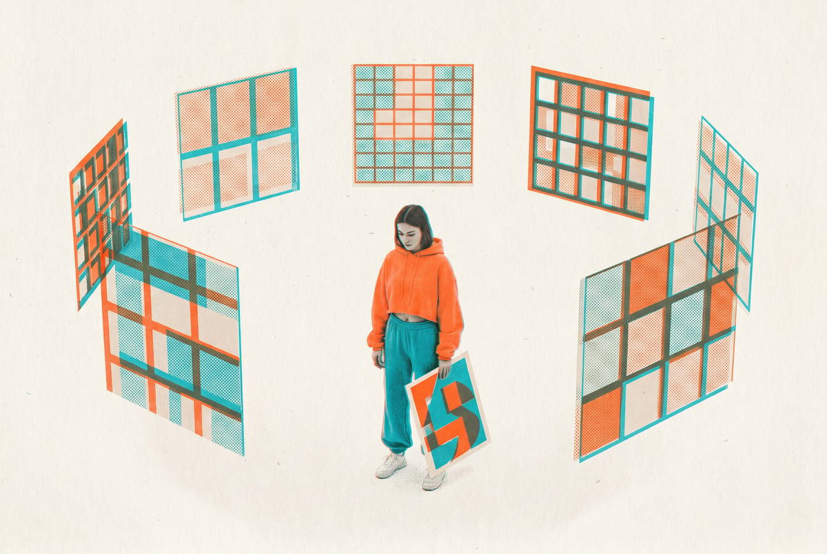
The five systems, and when each one earns its place
Notion — for anything educational
Notion’s design system is built around clarity. Lots of breathing room, clean hierarchy, minimal decoration. Everything has space around it. The visual logic is: if something is important, give it room to be important — don’t crowd it.
This makes it the right choice for educational content. School pages, course welcome screens, tutorial walkthroughs, lesson slides. When your audience is trying to learn something, visual noise is the enemy. Notion’s system removes the noise.
The prompt that works here: Using the notion design system, design the welcome page structure for my school community about [your topic]. Claude will output something clean, structured, and paste-ready. Not just better-looking than the default — actually easier to navigate, which matters for keeping new members engaged past day one.
If your brand is about teaching, Notion is your starting point.
Apple — for premium and high-ticket
Apple’s design system communicates value before anyone reads a word. The typography is confident. The spacing is generous. The hierarchy is clear. When you see something built in Apple’s visual language, you assume it’s worth taking seriously.
That’s exactly what you want for a landing page on a high-ticket offer, a client presentation, or a webinar opt-in. The visual feel does persuasion work before your copy does.
Built like a system. Not vibe-coded.
Remy manages the project — every layer architected, not stitched together at the last second.
The slide deck use case is particularly good here. Ask Claude: Using the Apple design system, create a five slide deck explaining AI agents. Claude outputs HTML with animations and transitions — something you can screen-share directly from a browser without exporting or converting anything. It’s more impressive than a PowerPoint and it took one prompt.
Same logic applies to landing pages: Using the Apple design system, build a single page landing page for my offer. The output will look more considered than most competitor pages, and it cost you a single prompt.
Anthropic/Claude — for standing out from the tech default
Most AI and tech brands look the same. Dark mode, blue accents, sans-serif everything, very corporate, very cold. The Anthropic/Claude design system goes a different direction: warm tones, slightly parchment-like, intelligent without being sterile.
It’s harder to describe than the others because the effect is more about feel than specific visual choices. The best way to understand it is to ask Claude to render it as an HTML preview and look at it next to Apple and Stripe. The difference is immediately obvious.
When to use it: if your brand is about thoughtfulness, depth, or ideas — and you want to look different from the typical tech aesthetic — this system is worth exploring. It’s the one most likely to make someone stop and notice that something looks different, in a good way.
Uber — for video graphics
Uber’s design system is pure black and white, geometric, maximum contrast. It’s not the most interesting-looking system on the list. It is the most functional for a specific problem: on-screen visuals in video.
Low-contrast design looks fine on a monitor. On camera, through compression, on a phone screen — it falls apart. Text becomes hard to read. Details disappear. Uber’s system is built for exactly the opposite: everything reads clearly at any size, on any background.
If you’re making YouTube videos and you explain concepts with on-screen charts, diagrams, or animated explainers, this is your system. Ask Claude to build the visual, screen-record it or export it as a still, and you’re done in minutes instead of hours in After Effects.
Stripe also works here if you want something slightly warmer than pure black and white — more on that below.
Stripe — for business credibility
Stripe’s design system is white space, precision, and seriousness. It reads as professional and trustworthy without being cold. It’s the system you want when your audience needs to be convinced you’re legitimate before they’ll engage with what you’re saying.
Pitch decks. Business-facing content. Anything where the person on the other side is evaluating you, not just consuming content. Stripe’s visual language says: we take this seriously, and you should too.
It also works well for video graphics when you want something slightly less stark than Uber — the contrast is still high enough to read on camera, but there’s more visual warmth.
How to actually use them: the workflow
The install takes about 30 seconds. Open Claude Code (desktop or CLI) and send this:
Install the awesome design MD GitHub repo for me and recommend how I can use itClaude grabs all 57 files and copies them to your workspace. Now you have the full library available as context in any project.
Other agents ship a demo. Remy ships an app.
Real backend. Real database. Real auth. Real plumbing. Remy has it all.
Before you commit to a system, ask Claude to open a few as HTML previews so you can see them side by side. Design choices should be visual, not conceptual. You don’t want to pick Notion because it “sounds right” — you want to see it next to Apple and Uber and decide based on what actually fits your brand.
Once you’ve picked a system, the pattern for every use case is the same:
- Reference the design system by name in your prompt
- Describe what you want to build
- Let Claude run
For school pages: Using the notion design system, design the welcome page structure for my school community about [topic]
For slide decks: Using the Apple design system, create a five slide deck explaining [concept]
For video graphics: use Uber or Stripe, ask for the specific visual, screen-record or export as a still
For landing pages: Using the Apple design system, build a single page landing page for my offer
The HTML output for slide decks and landing pages is screen-shareable directly from a browser. No exporting, no converting, no additional tools. This is one of the underappreciated things about working with Claude Code — the output is already a deliverable, not a draft you have to finish somewhere else. If you’re curious how this kind of approach extends to more complex web builds, building animated 3D websites with Claude Code follows a similar pattern of going from prompt to browser-ready output.
Customizing for your own brand
Here’s the thing about using these systems publicly: Notion’s colors belong to Notion. You can use the structure, the spacing logic, the typography approach — but you need to put your own brand on top.
The way to do this is to ask Claude to rewrite the design system file with your specifications:
I love the notion design system structure, but I want my brand colors: dark navy background, gold accent, white text. Adapt this and save it as my brand_design.mdClaude rewrites the entire file with your specifications. Now you have a custom design system — Notion-level structure and quality, your visual identity. Save that file in your project and every output from that point forward follows the same rules.
This is the part that compounds. The first school page you build with your custom design system takes some iteration. The tenth one is automatic — you just reference brand_design.md and the visual consistency is already there. You stop making design decisions on every project because the system already made them.
This is also where the markdown format pays off in a way that’s easy to underestimate. Because your design system is just a text file, it travels with your project, it’s version-controllable, and any AI tool that reads context can use it. If you’re thinking about how this kind of spec-driven approach scales, Remy takes a similar idea further: you write your application as annotated markdown, and it compiles into a complete TypeScript backend, database, auth, and deployment. The spec is the source of truth; the code is derived output.
Where things go wrong
The output looks generic. This usually means Claude isn’t actually reading the design system file. Check that the file is in your workspace and that you’re referencing it explicitly by name in your prompt. “Using the notion design system” needs to match the actual filename.
The HTML preview doesn’t look right. Some design systems render better than others in a browser preview. If something looks off, ask Claude to open it as an HTML preview explicitly — don’t just ask for the output and assume it’ll render correctly.
You picked a system that doesn’t fit your brand. This is the most common mistake, and it’s why the visual comparison step matters. Notion and Apple look very different. Uber and Stripe look very different. Spend two minutes looking at HTML previews before you commit to one for a project.
You’re trying to use the design system across tools. The markdown files live in your Claude Code workspace. If you want to use your custom brand_design.md in a different project or a different tool, you need to copy it there. It doesn’t sync automatically.
The slide deck HTML doesn’t animate. Some browsers handle CSS animations differently. If transitions aren’t working, try Chrome. If you’re screen-sharing, test the animation before you go live.
Where to take this further
The five systems covered here — Notion, Apple, Anthropic/Claude, Uber, Stripe — are the ones that do most of the work for creator content. But there are 52 more in the repo. Airbnb, Linear, Vercel, and others are worth exploring once you’ve built the habit of working with design systems at all.
The custom brand_design.md approach is the real long-term move. Once you have a file that encodes your visual identity, every piece of content you produce can reference it. School pages, slides, graphics, landing pages — they all look like they came from the same place, because they did.
If you want to go further with Claude Code as a content production tool, automating social media content repurposing with Claude Code skills is a natural next step — same tool, different workflow, same idea of building systems instead of one-off outputs.
For teams building more complex AI workflows on top of this kind of content infrastructure, MindStudio handles the orchestration layer: 200+ models, 1,000+ integrations, and a visual builder for chaining agents and workflows — useful when the output of one AI step needs to feed into another automatically.
The 71,000 stars on this repo happened fast because the idea is simple: professional visual quality shouldn’t require a designer or a design tool. It should require knowing which rules to follow. Now you have the rules.