How to Install 57 Brand Design Systems into Claude Code in 30 Seconds (No Packages Required)
The Awesome Design MD repo gives Claude Code 57 brand systems as plain markdown. Install takes 30 seconds with zero dependencies. Here's the full workflow.

57 Brand Design Systems in Claude Code, Installed in 30 Seconds
You’ve probably spent more time than you’d like to admit trying to make something look professional. A slide deck, a landing page, a community welcome screen. You know roughly what you want — clean, credible, not obviously DIY — but translating that into actual design decisions is where the time disappears.
The fix is faster than you’d expect. One prompt, about 30 seconds, and Claude Code has access to 57 complete brand design systems as plain markdown files. The install prompt is: Install the awesome design MD GitHub repo for me and recommend how I can use it. That’s it. No packages, no dependencies, no configuration. Claude grabs all 57 files and copies them to your workspace.
The repo is called Awesome Design MD, and it hit 71,000 GitHub stars in a matter of weeks. The stars are a signal worth paying attention to — this filled a gap that a lot of builders had been working around for a long time.
What You’re Actually Installing
Each of the 57 files is a markdown document describing a complete visual system for one brand. Apple, Notion, Airbnb, Stripe, Uber, Anthropic/Claude, and 51 more. Colors, typography, spacing rules, the overall visual logic that makes each brand feel the way it does.
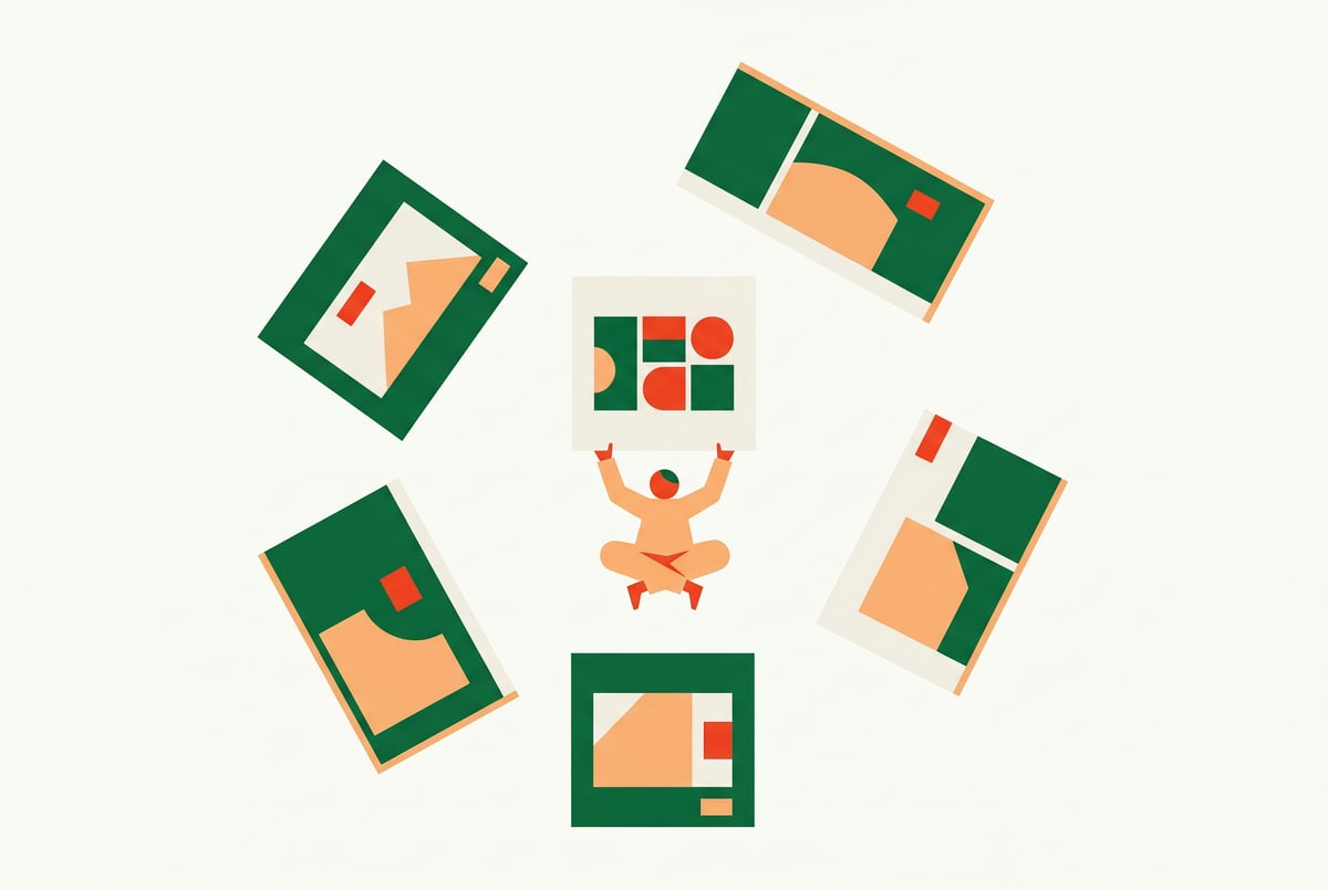
Remy doesn't write the code. It manages the agents who do.
Remy runs the project. The specialists do the work. You work with the PM, not the implementers.
The reason this works without any configuration is structural. Markdown is plain text. Claude reads it as context, the same way it reads anything else you put in your workspace. There’s no plugin to activate, no API to connect, no interface to learn. You copy the files in, and from that point on you can reference any design system by name in any prompt.
This is a meaningful difference from most design tooling. Template libraries need you to work inside their platform. Design tools need you to learn their interface. This just sits in your project as text, and Claude uses it as a blueprint whenever you ask it to build something.
The install prompt — Install the awesome design MD GitHub repo for me and recommend how I can use it — also asks Claude to surface recommendations, which is useful on first run. You get a quick orientation to which systems exist and what they’re suited for before you start building anything.
The Install, Step by Step
Open Claude Code — either the desktop app or the CLI. Paste the install prompt. Claude will clone the repo and copy the markdown files into your workspace. The whole thing takes around 30 seconds.
After that, ask Claude to open a few design systems as HTML previews. This matters more than it sounds. Picking a design system by name is an abstraction. Seeing it rendered — the actual colors, the actual type scale, the actual spacing — is how you make a real decision. Notion looks different from Apple looks different from Uber, and you want to see those differences before you commit to one for a project.
Because each brand is its own separate file, you can also mix systems. Apple’s typography with Notion’s color logic. Uber’s contrast approach with Stripe’s spacing. The files are independent, so Claude can pull from multiple at once if you ask it to.
One thing worth flagging early: these design systems are reference material, not templates to copy directly. Notion’s specific color palette belongs to Notion. Stripe’s exact typography choices are Stripe’s. What you’re extracting is the structural logic — the quality baseline, the spacing approach, the visual hierarchy — and then applying your own brand identity on top. More on that in the customization section below.
The Five Systems Worth Starting With
Most of the 57 systems are interesting. Five of them do the majority of the practical work for builders and content creators.
Notion is the default for anything educational. Course pages, tutorial slides, community welcome screens. The visual logic is minimal — lots of breathing room, clean hierarchy, nothing competing for attention. If you’re building something meant to teach, Notion’s system keeps the content front and center.
Apple is for anything where the first impression needs to carry weight. Landing pages for high-ticket offers, presentations to clients, anything where you need the design to signal that what you’re selling is worth what you’re charging. Apple’s system creates a premium feel before anyone reads a word.
Anthropic/Claude is the outlier on this list. Warm, slightly parchment-like, not cold and corporate. It reads as thoughtful rather than slick. If your brand needs to stand out from the typical SaaS aesthetic — all blues and gradients and rounded buttons — this system is worth exploring. It’s genuinely different from everything else in the repo.
Uber is the video graphics system. Pure black and white, geometric, maximum contrast. The specific problem it solves: low-contrast design falls apart on camera. Charts and diagrams that look fine on a monitor become unreadable when you’re screen-sharing or when a viewer is watching on a phone. Uber’s system is built around contrast that holds at any size, on any background. For YouTube explainers, on-screen diagrams, animated slides you’re recording — this is the right starting point.
Stripe is for business-facing content. Lots of white space, serious credibility, the visual language of a company that handles money and takes that seriously. Pitch decks, anything going to an audience that needs to be convinced you’re legitimate. The system communicates trustworthiness without saying anything directly.
Four Things You Can Build Today
The coverage around this repo has focused heavily on app and website development. That’s a real use case, but it’s not the only one. Here are four specific builds that work well with this workflow.
School and community pages. Most community welcome pages look like whatever the platform default gives you. No visual hierarchy, no brand feel, nothing that communicates that someone thought about the experience. Prompt: Using the Notion design system, design the welcome page structure for my school community about [topic]. The output is clean, structured, and paste-ready. Better looking, but also easier to navigate — which matters for keeping new members engaged past day one.
Slide decks. Ugly slides don’t just look bad. They quietly undermine confidence in the content. People don’t consciously think “these slides look unprofessional” — they just feel slightly less certain about the person presenting. Prompt: Using the Apple design system, create a five slide deck explaining AI agents. Claude outputs HTML with animations and transitions. You screen-share it directly from a browser. No exporting, no converting, no PowerPoint.
This is also where the design-system-as-context approach shows its depth. If you’re building AI-powered workflows and want consistent visual output across multiple slide decks, platforms like MindStudio handle this kind of orchestration — 200+ models, 1,000+ integrations, and a visual builder for chaining the generation steps together without writing the glue code yourself.
Video graphics. On-screen visuals for YouTube videos, charts, diagrams, animated explainers. Use Uber or Stripe for high-contrast output. Screen record the result or export it as a still. The alternative is spending hours in After Effects or Figma. This approach takes minutes. The Uber system in particular is designed for exactly this problem — visuals that read clearly at any size, on any background, under any recording conditions.
Landing pages. Prompt: Using the Apple design system, build a single page landing page for my offer. The output will look better than most competitor pages, and it cost you one prompt. The Apple system does the heavy lifting on visual hierarchy, spacing, and the premium feel that makes offers look credible.
The pattern is the same for all four: reference the design file by name, describe what you want to build, let Claude run. The design system handles the visual decisions so you can focus on the content.
Customizing for Your Own Brand
The customization step is where this workflow goes from useful to durable.
Other agents start typing. Remy starts asking.
Scoping, trade-offs, edge cases — the real work. Before a line of code.
Once you’ve identified a system whose structure you like, adapt it rather than copying it. Tell Claude: I love the Notion design system structure, but I want my brand colors: dark navy background, gold accent, white text. Adapt this and save it as my brand_design.md.
Claude rewrites the entire file with your specifications. The result is a custom design system — Notion-level structural quality, your visual identity. Save that file in your project, and every output you generate from that point forward follows the same rules. School pages, slide decks, video graphics, landing pages — all consistent, all on-brand, without making design decisions on every individual project.
This is the actual value of a design system. Not any single thing you build today, but the fact that every future output starts from the same baseline. Professional content production isn’t more effort per project — it’s a better system running underneath all the projects.
The brand_design.md approach also connects naturally to how spec-driven tools work more broadly. Remy, for instance, takes a similar philosophy to a different problem: you write an annotated markdown spec describing your application, and it compiles a complete TypeScript full-stack app from it — backend, database, auth, deployment. The spec is the source of truth; the generated code is derived output. The pattern of “write the intent in markdown, generate the artifact from it” is showing up across a lot of the most useful AI tooling right now.
The Zero-Dependency Architecture
The reason this workflow is worth understanding technically, not just practically: it demonstrates something about how Claude Code handles context.
Most tools that give Claude design capabilities require some form of integration — a plugin, a configuration file, an API connection. Awesome Design MD requires none of that because the design systems are plain text. Claude reads markdown as context. There’s no distinction, from Claude’s perspective, between a markdown file describing your project requirements and a markdown file describing Apple’s typography system. Both are just context.
This is the same principle behind using design.md files with Claude Code for consistent UI — the idea that a structured markdown document can carry enough design intent to produce consistent visual output across an entire project. Awesome Design MD takes that principle and applies it to 57 existing brand systems simultaneously.
It also means the workflow is portable. The files live in your project. You can reference them from any prompt, in any session, without reinstalling anything. If you add a new project, copy the files over. If you want to update your custom brand_design.md, edit the file directly. Nothing breaks because there’s nothing to break.
For builders thinking about how to extend this kind of context-driven approach, the Claude Code content marketing skill system covers a related pattern — building reusable skills that Claude can reference across projects, which pairs naturally with persistent design system files.
What 71,000 Stars Actually Means
The repo hit 71,000 GitHub stars in a few weeks. That’s not a metric to dismiss. It’s a signal that a lot of builders had the same problem — they wanted design quality without design overhead — and this solved it in a way that felt right.
Other agents ship a demo. Remy ships an app.
Real backend. Real database. Real auth. Real plumbing. Remy has it all.
The plain-markdown approach is the key insight. It’s not clever engineering. It’s the recognition that Claude’s context window is the integration layer, and that anything you can express as text can become a persistent capability without any configuration overhead.
The install takes 30 seconds. The design decisions it removes from every future project are worth considerably more than that.
If you want to go deeper on what Claude Code can do with structured context files, the Andrej Karpathy LLM wiki approach to building a personal knowledge base with Claude Code covers the same underlying mechanic applied to a different problem — turning raw documents into structured markdown that Claude can query and reason over.
The pattern is worth understanding. Once you see it, you start finding a lot of places to apply it.